

The Best Colour Scheme for Your Home: 5 Reasons to Choose Neutrals
If you’re planning a home renovation, new build, or interior refresh, choosing the right colour scheme is one of the biggest decisions you’ll make.
And while bold colours can be tempting, a neutral colour scheme is the smartest and most timeless choice — it creates a versatile, high-end look, makes styling easy, and even increases your home’s resale value.
So why is a neutral colour palette the best option for your home? Let’s break it down — plus, we show you how to create a neutral colour scheme that transforms your home, makes styling effortless, and ensures your space never feels outdated. #letsgo

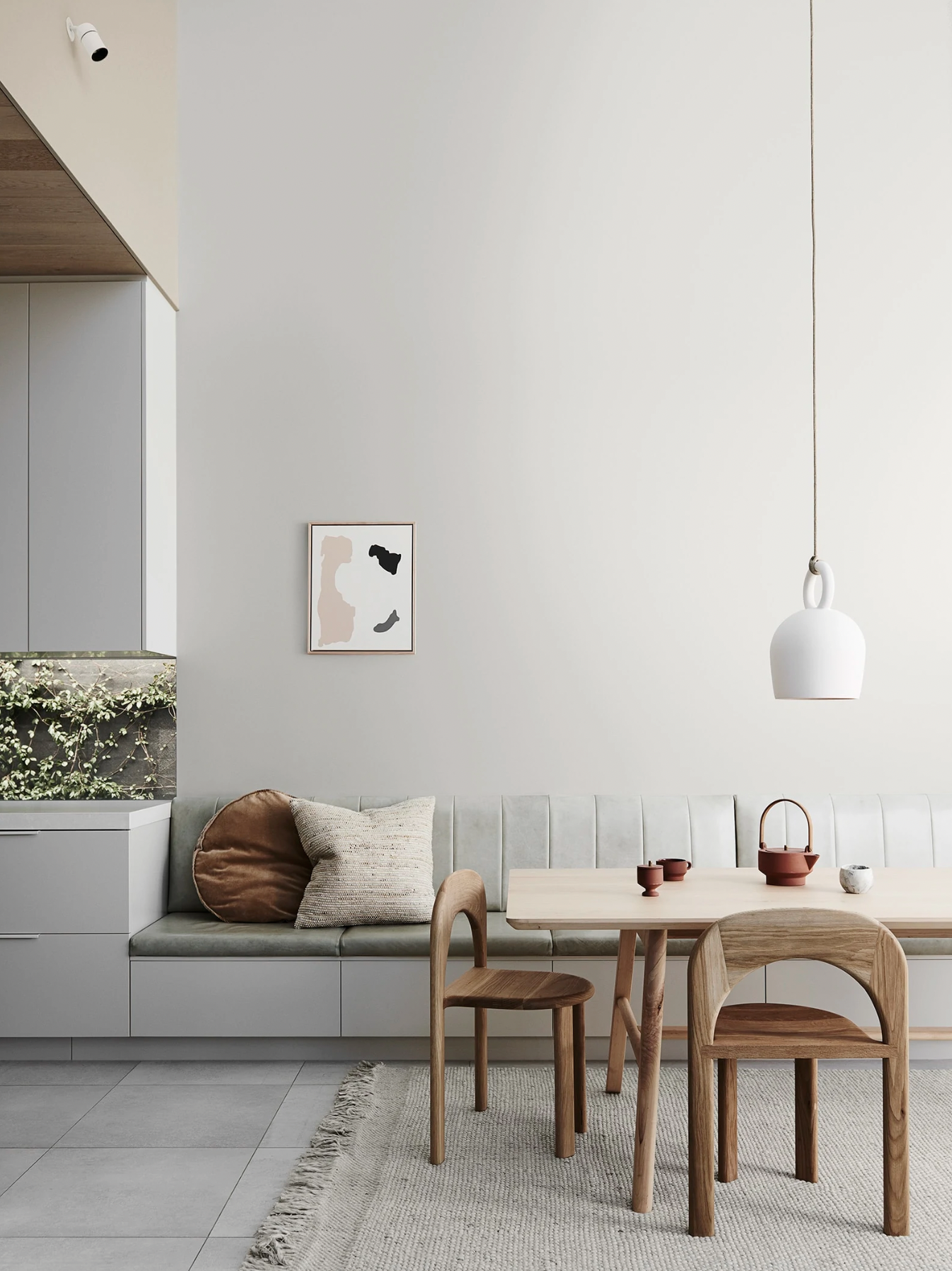
Neutral Dining Room • CM Studio
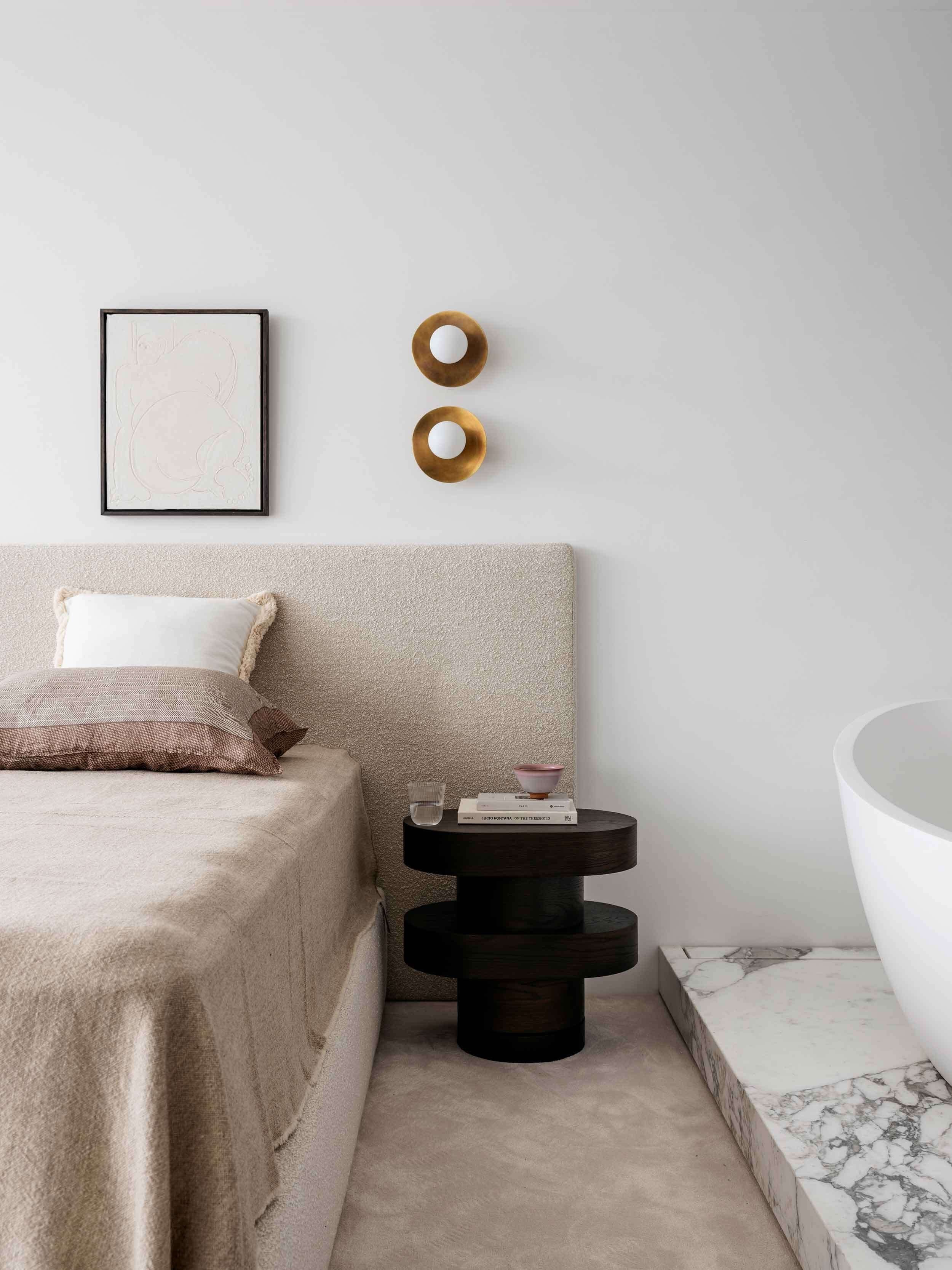
Neutral Bedroom • Nina Maya
A Neutral Colour Scheme Never Goes Out of Style
Trends come and go, but a neutral colour scheme ensures your home always looks fresh, modern, and effortlessly stylish — without the risk of it dating too quickly.
By choosing timeless, neutral tones for major design elements like paint, flooring, cabinetry, and tiles, you create a home that adapts seamlessly to evolving styles while always feeling sophisticated.
Why Do Neutral Colours Always Work?
✔ Classic shades like white, beige, taupe, and greige create an elegant, balanced foundation.
✔ Neutrals enhance natural light, making spaces feel larger and more inviting.
✔ A neutral backdrop works with any aesthetic or furniture — from modern minimalism to classic elegance.
💡 Z+S Pro Tip: Layer textures and patterns using materials linen, stone, tiles, cabinetry and timber, to add depth and warmth to a neutral palette, preventing it from feeling flat.

Zephyr and Stone • Retreat House Bathroom Neutral Colour Scheme
It’s A Sustainable Colour Scheme That Lasts
A neutral home colour scheme isn’t just about aesthetics — it’s also one of the most sustainable design choices you can make.
By choosing timeless neutrals for your home’s core elements, you reduce the need for frequent repainting, retiling, or renovating. This means less material waste, fewer costly updates, and a home that remains effortlessly stylish for years to come.
Why Neutrals Are a Sustainable Choice
✔ Less need for redoing interiors — saving time, money, and resources.
✔ Durable, neutral finishes stay relevant longer, reducing unnecessary waste.
✔ Easily refreshed with small updates, rather than full-scale renovations.
💡 Z+S Pro Tip: Pair neutral tones with sustainable materials like natural timber, recycled stone, and linen for a home that’s both eco-friendly and effortlessly stylish.

Zephyr and Stone • Classic Coastal Bathroom Plans + Colour Scheme

Zephyr and Stone • Classic Coastal Bathroom
A Versatile Colour Scheme That Works for Any Home
A neutral colour scheme gives you the flexibility to change up your home’s style without major renovations.
Unlike bold colours, which can limit your styling choices, a neutral foundation lets you experiment with different trends over time — without committing to a colour that might feel outdated in a few years.
How Neutrals Make Styling Effortless
✔ Easily switch up your look with statement furniture, artwork, and décor.
✔ Neutrals work with any design style — modern, Hamptons, classic, or contemporary.
✔ Allows for seasonal updates without needing to repaint or renovate.
💡 Z+S Pro Tip: Introduce contrast through darker accents like black window frames, tapware, or feature lighting to add depth and definition to a neutral space.
Lighter Neutrals Make Your Home Feel Bigger
One of the biggest advantages of a neutral colour scheme is its ability to visually expand a space — making rooms feel larger, airier, and more open.
Lighter shades like soft whites, warm beiges, and greige tones reflect natural light, helping even compact spaces feel more inviting.
Why Neutral Colours Enhance Space
✔ Lighter neutrals reflect light, creating an open, airy feel.
✔ Helps small rooms feel more spacious without structural changes.
✔ Creates seamless flow throughout the home for a more cohesive look.
💡 Z+S Pro Tip: Use the same neutral tone across walls, cabinetry, and trims for a streamlined, expansive effect.

Image via Dulux • Neutral Home Colour Scheme for Interior Design
A Neutral Colour Scheme Increases Your Home’s Value
If you’re renovating with resale in mind, a neutral colour scheme is one of the best ways to increase your home’s appeal and attract more buyers.
Potential buyers often struggle to visualise themselves in a home with bold, personalised colours. A neutral colour palette provides a clean slate, making it easier for buyers to picture their own style in the space—leading to higher interest and a faster sale.
Why Neutral Homes Sell Faster
✔ More buyers are drawn to neutral interiors, increasing demand.
✔ A neutral colour scheme won’t date quickly, making your home look fresh and modern.
✔ Neutral tones highlight the home’s best features, rather than distracting from them.
💡 Z+S Pro Tip: A neutral home provides instant market appeal, making it a smart investment whether you’re selling now or in the future.
Ready for your Neutral Colour Scheme Checklist? That’s next…

Zephyr and Stone • Retreat House Living Room with a black, white and grey colour palette.
How to Create a Neutral Colour Scheme That Feels Designed
A neutral colour scheme isn’t just about picking a few beige tones and calling it a day. To create a home that looks intentional, high-end, and effortlessly stylish, you need to layer neutrals the right way. Here’s how to make sure your neutral colour palette feels designed, not dull.
1.Choosing the Right Neutral Undertones
Not all neutrals are created equal—each shade has an undertone that can shift the overall feel of a space.
✔ Warm neutrals (beige, taupe, greige, grey) add comfort and calm, and work well with timber and organic textures.
✔ Cool neutrals (soft greys, crisp whites) create a modern, airy feel, but can appear stark in certain lighting. #choosecarefully
✔ True neutrals (balanced whites and greiges) work universally, providing a versatile foundation for any design style.
💡 Z+S Pro Tip: Always test paint swatches in different lighting conditions before committing to a shade—what looks neutral in the morning may appear yellow or blue by evening.
2. Layering Textures for Depth and Interest
A neutral space can feel flat without depth and contrast—this is where texture comes in.
✔ Use woven fabrics (linen, wool, rattan) to create warmth.
✔ Mix natural stone, timber, or concrete for an organic, high-end finish.
✔ Add subtle patterns in tiles, rugs, or textiles to create movement without overwhelming the space.
✔ Contrast different textures and finishes — matte cabinetry with honed stone benchtops or brushed finishes with raw, natural materials or polished metallic accents to create depth and a sophisticated, layered look.
💡 Pro Tip: Mixing timber, linen, and stone with soft matte finishes ensures a neutral space feels warm, inviting, and intentionally designed.
3. Using Contrast to Create Balance
Even in a neutral colour scheme, contrast is key to preventing a washed-out look.
✔ Introduce dark neutrals like charcoal or deep colours in window frames, tapware, or statement furniture.
✔ Layer different neutral tones—for example, pair soft white walls with a warm greige sofa and timber accents.
✔ Use black or metallic accents sparingly for definition and a polished finish.
💡 Z+S Pro Tip: If an all-neutral room feels too soft, incorporate a bold feature like a darker rug, oversized artwork, or sculptural lighting, sticking to muted, sophisticated colours.
4. Incorporating Natural Materials for Warmth
Neutrals thrive when paired with natural elements that add character and warmth.
✔ Timber in flooring, cabinetry, or furniture brings warmth and texture.
✔ Stone and marble introduce natural patterning that prevents a neutral palette from feeling plain.
✔ Linen and woven fibres in curtains, rugs, or furniture add softness and depth.
💡 Z+S Pro Tip: A mix of light and dark natural finishes keeps the space feeling organic yet refined—for example, blonde oak floors with deep walnut furniture.
5. Adding Metallic Accents for a Polished Look
Metallic elements add dimension and elegance to a neutral space, breaking up monotony while keeping the colour scheme understated.
✔ Brass and gold bring warmth to beige, taupe, and greige palettes.
✔ Matte black or gunmetal adds contrast to lighter neutrals.
✔ Brushed nickel and chrome work well with cooler tones for a sleek, contemporary feel.
💡 Z+S Pro Tip: Keep metallics consistent throughout your home—if your kitchen has brass tapware, carry the same finish into your bathrooms and lighting.

Neutral Living Room ● Webster Architecture & Interiors
Final Thoughts: Why a Neutral Colour Scheme is the Best Choice for Your Home
A neutral colour scheme is more than just a trend—it’s an investment in timeless, effortless style.
✔ It makes your home feel bigger, brighter, and endlessly versatile.
✔ It’s a sustainable choice, reducing the need for constant updates.
✔ It increases your home’s value by appealing to more buyers.
Whether you’re renovating, building, or simply refreshing your interiors, embracing a neutral colour palette ensures your home will always feel timeless, sophisticated, and effortlessly stylish.
Need more expert home design tips? Explore our colour guides here.