

10 Common Interior Colour Scheme Mistakes + How To Avoid Them
Your interior colour scheme can MAKE or BREAK the look and feel of your home.
And the colours, finishes and materials you choose for a room will not only affect the aesthetic but also the mood and overall livability of the space. That’s why choosing the right white paint is absolutely critical to nailing both your space and achieving the style of home you’re visualising. But where do you start?
If the endless paint swatches and paint samples have got you overwhelmed, worry not! We’re breaking down the ten most common home colour scheme mistakes and how to avoid them at your place… #letsgo

Aimee McKechnie • Modern Coastal Living Room with Sheer Curtains
Ignoring Room Size
Your home colour scheme choices will affect how big or small a room looks and feels.
Ignoring your room size and ceiling height when selecting colours can make small spaces feel cramped and large spaces appear empty or unfinished. Generally speaking, choose whites or light colours which reflect light to make rooms feel bigger, and save darker colours which absorb light for bigger rooms, as they can make smalle spaces feel even smaller.

Cindy Rendely Architexture • Modern Rustic Living Room with Black Timber Panel Fireplace
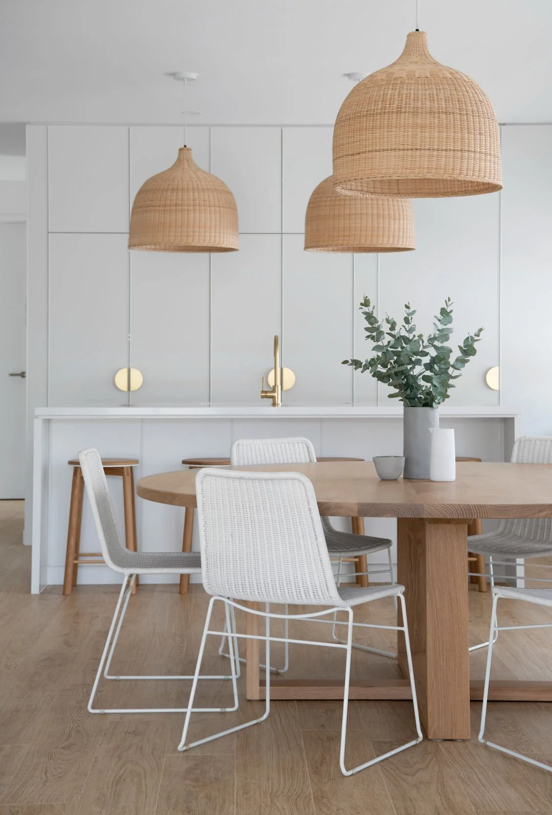
Zephyr and Stone • Classic Coastal Dining Room with White and Timber Furniture

2. Not Utilising Natural Light
If there’s one thing that you’ll find in pretty much EVERY successful home design, it’s natural light.
Natural light makes spaces feel good, and affects how big or small a room feels, and how colours look. Failing to account for natural + artificial lighting when looking at a paint swatch, can result in colours appearing differently than expected once installed. Always assess lighting conditions in every room in your home, taking into account the room orientation in relation to North, East, West or South, and consider how it will affect your chosen colour palette.

Bone Made • Modern Coastal Living Room with Large Windows

Tom Robertson Architects • Contemporary Walk in Wardrobe and Ensuite Design
3. Not Understanding Colour Psychology
If you didn’t already know, your chosen house colours can evoke emotions. Not understanding the psychological impact of a colour choice can lead to an atmosphere that doesn’t align with the intended mood for your space.
Colours like yellow can make people feel uneasy, while very cool greys makes rooms feel cold or sterile. Opt for neutral + muted colours, especially for hard finishes and large surface areas, and save bold colours for accessories or furnishings that are easy to change or update.

Zephyr and Stone • Coral House Living Room with neutral furniture and furnishings
4. Neglecting the Room’s Purpose
Each room in your home no doubt serves a purpose — for example, a study nook, bedroom, or mudroom. Not considering the overall function of a space can lead to colour choices that are impractical or unsuitable for the room’s intended purpose.
For every room in your home, consider who will use the space, at what time of day, and whether you want to create a quiet atmosphere for work or open area for entertaining and family members to come together.

Zephyr and Stone • Retreat House Master Bedroom Design with Neutral Colour Palette

Fiteni • Modern Home Office Design with Soft Neutral Colour Palette
5. Not Comparing Undertones
Overlooking undertones in paint colours or materials can lead to clashes in your colour scheme, and is one of the most common mistakes we see in colour selections. Comparing undertones is crucial for a harmonious look, and the easiest way to check that your interior colours share the same undertones is to create your own flatlay.
Do this by laying all your samples together in a room with good natural light, and comparing them at different times of the day to ensure they complement one another. You’ll notice that some samples may have warmer or cooler undertones and that those with similar undertones work best together.

Zephyr and Stone • Hamptons Style Materials and Finishes Flatlay

Zephyr and Stone • Hamptons Kitchen with marble benchtop and brass tapware and handles

6. Not Testing Paint Samples
If you’re unsure about your colour selections, a paint sample pot is your best friend! It’s inexpensive, and a critical part of the process of testing + comparing colour samples in order to get your colour scheme spot on first time around.
Don’t skip this step because wall colours always appear differently depending on lighting conditions, the room itself and the shadows that are cast. For the most accurate result of how a colour will look, test and compare samples in the actual space they'll be installed or used.

Zephyr and Stone • Neutral Light Green Paint Sample Pot

Zephyr and Stone • Neutral Office with Light Green Wall
7. Overlooking Surrounding Elements
Always consider existing furniture, colours + features that are being retained in your new design, and ensure they align with your new interior colour scheme and home style.
Not considering existing furnishings, fixtures, or architectural elements can lead to colour choices that clash rather than complement and lead to a home or space that looks and feels unbalanced and out of place.

Designed by Jam • Contemporary Living Room with Curved Sofa
8. Inconsistency Across Spaces
Those stunning homes we see on Pinterest all have one thing in common — they flow seamlessly from room to room.
Lack of colour cohesion between rooms will result in a disjointed interior design. Unless you're going for an eclectic, bold or artsy home style, repetition of colours from one room to the next is key to creating cohesion and that interior designed look in your home.

Zephyr and Stone • Retreat House Dining Room with light neutral colour palette

The Design Villa • Modern Coastal Living Room with Warm Neutral Colour Palette
9. Ignoring Personal Preferences
At the end of the day, your home has to feel comfortable for you and your family. Neglecting personal preferences and solely following colour trends or advice can result in a design that doesn't feel authentic or yours. To achieve this, infuse design trends sparingly and don't overdo them as they can date before the paint dries #punintended.
…And, don’t feel the need to do what everyone else is doing — your home project's end result should be a home that genuinely reflects your individual style and personality.

Rama Architects • Modern Living Room with Eclectic Furniture Curation
10. Too Many Interior Colours
An excessive number of paint colours in one space can create visual chaos?
At Z+S we're huge advocates of investing in a neutral colour scheme, especially for hard finishes — because it results in a timeless home design with longevity, that’s more relaxing and inviting than it’s counterparts. A neutral, well-balanced colour palette typically includes muted colours in varied tones, and contrasting material grains, finishes + textures.

Sabdia Constructions • Modern Open Plan Kitchen Dining Area

Zephyr and Stone • Hamptons Bathroom with brass tapware